Photoshop Meddlings

Status
Not open for further replies.
beyonce-1.png


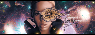
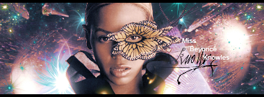
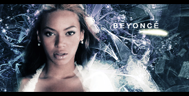
I tried something new with Beyoncé here, first I rendered the image myself from a picture, using the lasso and feathering. And I tried to make the background kinda..."sparkle" I don't know if I like it or not though D= I think it's good but...I don't know.

And, here's a Fran one. I didn't want to add text because I thought it would ruin it somehow...

Fran.png
 
Last edited:
oooh.. i likes them both.... The Fran one is awesome and your right about text... i dont think it would work on that one. The Beyonce one looks great. I love the background ^_^
 
ohhhh, very good Mark.

I do like the backgrounds of both sigs. The background of the Beyonce one is good, and yes, it does sparkle in a way. Also, the Fran sig is good. The background gives the impression that its a forest, or maybe thats just me :elmo:
 
Fran looks b00tiful. Loving the hints of blue in the background :3
 
For this one I tried using only brushes and the default tools, I ended up using only 2 C4Ds in it though, and like with the Fran one, I thought text would kill it >_>

Dratini.png
 
I really like that Fran one. It's just so sparkly and very appealing to the eyes (my eyes, anyway). The silver sparkly stuff on the BG goes well with that mask-like thing on her face, so you definitely got some kind of theme going on there. Beyonce's alright...her render doesn't really go well with the background though because of the color theme. (I'm really into color theme if you already can't tell). But nice work with the background nonetheless. As for that Pokemon one...looks a bit...empty, especially on the left side. But I think I know what you were trying to do here...judging from those pink curvy lines trailing behind the Pokemon - hence the reason for the image placement there, correct? I like the idea, but I wish there was a way to do it where the left side isn't completely exposed like that.

Other than that, keep it up! You're doing a great job!
 
I like the Fran one a lot.

I think the lighting and effects you've used in there are great, they really compliment her. xD

I'm not so keen on the other two. I think the Beyonce one was larger and at some point you re-sized it manually? It just looks as though the background has been distorted due to a re-size.

I think the Dratini one could do with some darker effects in the background and maybe some text.

Good job altogether though, Mark. Nice work. :monster:
 
Ah that looks great, much better than the other one. I think the render looks good there and you've done a good job with the background.

Well done. :monster:
 
Much better. The colors matches more and the effects are nice. But I think there's that "floating head" syndrome in play. o.o Just a bit though.
 
The stock is great,but I think it'd suit better in a vector tag.The part of the head needs better blending with the BG.Sorry but I'm not too fond of it,I've seen better from you Aerith.
The BG alone is great and colorful but I'd don't like it with that kind of stock.
 
What is a Vector tag? O_O

Anyhoo, if this one isn't good, I'm stumped, I really am -

Beyonce3.png


And a matching avatar xD

Beyoncavatar.png


I loved that I had a brush that said the Diva thing, it just seems perfect xD
 
Last edited:
Yeah,well done.It looks better now that you edited it.Love the avatar.
The second one I think it needs some lighting,mostly the stock.
 
The avatar is amazing. ^_^
I love the second sig the best (although the first is great too!), the font, render/stock and the vibrant colours flow together amazingly well!
Keep up the great work. :wink:
 
Oh that Assassin Creed one is very good. It kinda gives off that icy look to it due to the color theme and how it generally looks like overall. The lighting is quite superb too and he seems to be blended in well. Good job!
 
I find the Assassin's Creed's text a little distracting.The tag could do pretty well without it as well.I like it,but better without text.
 
I tried something very different from my normal style with this signature, following a very cool tutorial -

Glory2.png


I didn't like the sides though, so I cropped it -

Glory.png
 
Status
Not open for further replies.
Back
Top