Navigation
Install the app
How to install the app on iOS
Follow along with the video below to see how to install our site as a web app on your home screen.
Note: This feature may not be available in some browsers.
More options
You are using an out of date browser. It may not display this or other websites correctly.
You should upgrade or use an alternative browser.
You should upgrade or use an alternative browser.
Photoshop Meddlings
- Thread starter Daenerys
- Start date
- Tagged users None
- Status
- Not open for further replies.
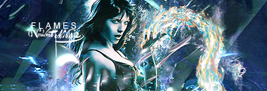
I saw this render, had no idea what it was, but thought it looked pretty so I had to work with it xD
Version 1
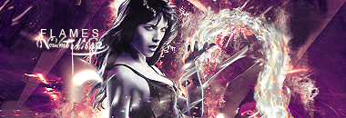
Version 2

Version 1
Version 2
- Joined
- Dec 14, 2006
- Messages
- 11,628
- Location
- California
- Gil
- 0


- FFXIV
- Mitsuki Calei
- FFXIV Server
- Lamia
- Free Company
- Gaia
That is freakin' awesome! I definitely love the first version better though, just because I know you're notorious for using so much purple in your sigs. =P
But really, the effects are quite powerful and you managed to blend the render with the background colors. Great job!
One thing I don't like though...is the girl's face. o.o She has that crazed-look about her that bothers me.
But really, the effects are quite powerful and you managed to blend the render with the background colors. Great job!
One thing I don't like though...is the girl's face. o.o She has that crazed-look about her that bothers me.
I know, her face is weird 
But thank you very much for the compliments ^^
Also,
Version 3
But thank you very much for the compliments ^^
Also,
Version 3
Last edited:
- Joined
- Jun 20, 2006
- Messages
- 2,517
- Age
- 33
- Location
- West New York, NJ
- Gil
- 3
- FFXIV
- Itami Raizou
- FFXIV Server
- Lamia
Version 1 is the best I think the color matchs well, and I like those effects you have O_O really impressive, nice job mate.
Here's the link to the original render, if anyone wants it.
And, I can't help but feel a certain something is missing so...
V4
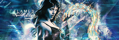
And, I can't help but feel a certain something is missing so...
V4
Last edited:
Definitely your best sigs so far in my opinion...they are amazing. All versions are! ")
The colours and render blend amazingly well, especially #3 and the font is fantastic...and the woman looks hawt xD
Awesome work, keep it up :wink:
The colours and render blend amazingly well, especially #3 and the font is fantastic...and the woman looks hawt xD
Awesome work, keep it up :wink:
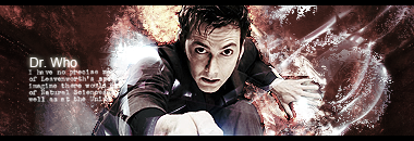
Thanks for the compliments guys ^^ Anyhoo, my friend was round and asked me make her something to do with Dr Who on photoshop, I just finished it now though -

- Joined
- Aug 28, 2007
- Messages
- 13,511
- Location
- Manchester
- Gil
- 222
- FFXIV
- Bambi Branford
- FFXIV Server
- Lamia
Oooh I really like that one Mark, well done 
The text is a bit small though I can't read it
The text is a bit small though I can't read it
You're not supposed to be able to read it The "Dr Who" part is supposed to be legible, the other is a text brush so it looks pretty xD
EDIT - And, I also updated my first post, so all my newest / favourite works are located there ^^
The "Dr Who" part is supposed to be legible, the other is a text brush so it looks pretty xDEDIT - And, I also updated my first post, so all my newest / favourite works are located there ^^
Last edited:
- Joined
- Dec 14, 2006
- Messages
- 11,628
- Location
- California
- Gil
- 0
- FFXIV
- Mitsuki Calei
- FFXIV Server
- Lamia
- Free Company
- Gaia
Lol yeah, the unreadable text is the "style" if you will. It looks very neat! I like it, Mark, you've been making fantastic signatures lately! =] I like the color theme, background, and effect... and it really goes with the powerful render you have there. Your text is getting better too! Great job, buddy!
Thanks for the compliments guys ^^ Anyhoo, my friend was round and asked me make her something to do with Dr Who on photoshop, I just finished it now though -
holy shizz Mark, I love it!!!!! Great use of colours, and the font is really nice too, but, as Bambi said, the text is too small to read
You're not supposed to be able to read it
.
Also, I sharpened the render on this one, and it looks loads better in my opinion -
Last edited:
darkslayers
Ex-Soldier
Better. Good job. I like your work. Keep it up!
Wow, I've been lovin' your latest tags; the last one, especially. You're really getting good. ") And better at text placement, backgrounds, and colors.
And better at text placement, backgrounds, and colors.
And better at text placement, backgrounds, and colors.Wow, I've been lovin' your latest tags; the last one, especially. You're really getting good.
Why thank you
I love text brushes, they make adding text easier / more pretty ^^- Joined
- Jun 20, 2006
- Messages
- 2,517
- Age
- 33
- Location
- West New York, NJ
- Gil
- 3
- FFXIV
- Itami Raizou
- FFXIV Server
- Lamia
Wow your latest tags are really getting better mate I like the last tag very much, keep it up.
I've always loved this Zelda picture, so I've wanted to make a Zelda signature for the longest time -
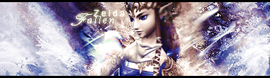
And, everything I've done lately has been done without any tutorials or anything ^^
And, everything I've done lately has been done without any tutorials or anything ^^
- Joined
- Dec 14, 2006
- Messages
- 11,628
- Location
- California
- Gil
- 0
- FFXIV
- Mitsuki Calei
- FFXIV Server
- Lamia
- Free Company
- Gaia
Very nice, Mark! Nice use of background effects - really worked well with the render. The only thing I'll say is about the text though. It's fine and all, but I think the text placement is a little off. It's too close to the image, especially the text, "Zelda". Other than that, great sig overall!
- Status
- Not open for further replies.