Photoshop Meddlings

Status
Not open for further replies.
Lulusig.png

It's pretty good. I like the flow all around her, but you have nothing going on in the background. Also a little lighting would help with depth.
 
With these signatures I tried something a little different, like, not using as many C4Ds, and trying more filter effects and whatnot.

Alexgoldensun.png


alexavatar.png


IsaacSOTW.png


isaacavatar.png
 
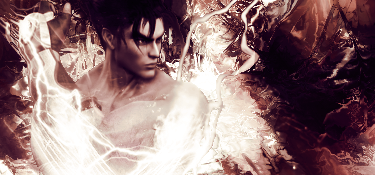
there are some fairly impressive sigs here although i dont like this one Mainly because i don't like the way the colours have been blended together
IsaacSOTW.png
 
I like the little effects in the first sig, especially in the left and right upper corner. Nice color theme you've got going on there, but I think the big lighting in the middle's somewhat...random and unnecessary. It would have been better if it wasn't so wide and big, but rather just little lighting emerging behind the subject here and there.

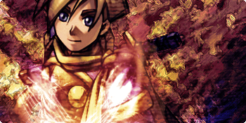
Second sig's pretty cool. I see you're working on textures as well. I also love the color theme here...earthy tones, ftw! xD I like the lighting in the subject as well as it wasn't just a plain white color (like the first sig), but with some pinkish effects included. Very nice.

However, try to not let it be so obvious that there's textures here and there though...be very subtle about it, to the point where you can't almost see them, but when you look closely, there is indeed textures and patterns going on in the background. (That's just my personal taste and style though.)

Like, I love the background texture/pattern you've got in there, but I can see lines overlapping the subject and some of the actual background. Personally, I don't like that type of texture. =/ Try exploring more with other textures and see different outcomes.

Overall though, pretty damn nice sigs, especially since you weren't really using any C4Ds. (Or if you were, it was very subtle, which is good).
 
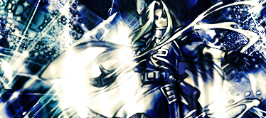
Wow. By far the best sig I've ever seen you do so far. True, there isn't that much color, but I don't mind at all actually. I like to stick with 2 - 4 colors overall as it just seems to appeal more in my eyes. The background is really tight, although I think you overdid the white in the middle.
 
Jeanxmen3.png


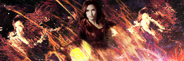
I started working on this when I put the X2 DVD on, I ended up missing most of the film, but I think it was worth it ^^ (I hope so anyway!)

I kinda want to put text on it, but I don't know where D=

And yeah, the stock kinda sucks (since it's all blurry D=) but, it was my first try working with a stock, rather than a render ¬_¬
 
Lol really? Your very first time working with a stock than a render? We're exactly the opposites then. xD

But anyway...this one's so-so. I like fire theme you've got going on in the bottom-right but then as it goes upward, it starts to look awkward since it doesn't really blend well with the background. I think it's the color theme and how they all flowed together...it's a little too bland with rough edges here and there. It just doesn't seem to work well, in my opinion.

But in all honesty, I can imagine how hard it was to work with a stock like that. I don't think I would be able to do it. >.> For one, the image is way too small. =/ It looks rather odd in a signature that size. My suggestion is to try to work with better stocks that has a good image size - it would definitely look better aesthetically speaking.
 
I don't really like the text on this one, but I felt it needed something to make it a little more...complete

Rikkenforlisa2.png


And this is my SOTW entry, but I fixed the stock D=

Peach.png
 
The first one: I don't like the width even so I start with a big one then I cut it, but still I like the colors you have there and the effects but I guess I don't like the text as you do.

2nd one: interesting but try sharpening the background a little, and the girl (I'm not a big fan of Mario) is like she's standing alone actually and try lowering the blur strength, that if you used it O_O
 
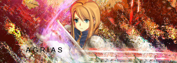
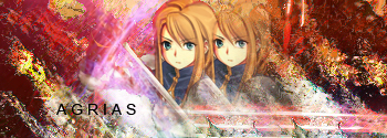
I really wanted to make an Agrias set (since I'm considering changing my username to Agrias ¬_¬) and these were the results -

Agrias2.png


Agrias1.png
 
nice sig for Agrias. it looks really good. you mind trying a shadow one for my sig? i swear i won't yell at you if you mess it up (i doubt you will after seeing the other sigs you made)
 
It's nice but I don't like the background. D:

And I feel you can do better with the text.
 
I tried recreating that Aerith signature in my first post (using that fabulous tutorial that Lirael made) but this time I used Agrias, and didn't make it in black and white ^^

Agriasfilmstrip.png
 
Wow, that's very good. Very nice flow and effects. Even the text is quite well done, I think. I can't decide which one I like better...probably the 2nd one but there's really not much difference between the two. This is probably the best sig I've seen you do. xD
 
Well I choose version 2 the colors matches better but the effects from much likely the same xD, and it's the best one you have made so far :monster: keep it up mate.
 
Very nice, Mark. I haven't seen all of this thread but I wouldn't be surprised if they are the best ones that you've done so far.

You must link me to those C4Ds. Now. :gasp:
 
Status
Not open for further replies.
Back
Top