Photoshop Meddlings

Status
Not open for further replies.
Thanks for the comments guys!

Pikachu.png


This was my entry for SOTW, just trying out smudging ^_^

And, this is something I'm working on now, but this is how it looks so far -
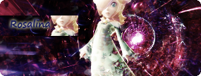
rosalina.png
 
Thanks for the comments guys!

Pikachu.png


This was my entry for SOTW, just trying out smudging ^_^

I knew something was somehow familiar about the style present in this signature. :neomon:

Anyhow, the only thing screwing the sig is the area around the tail.

And, this is something I'm working on now, but this is how it looks so far -

rosalina.png

This one looks quite good, but the text is still a no-no. :wink:
Also the stock seems to stand out too much.

The background is perfect, as usual. :neomon:
 
Though I admit the Pikachu Signature looks amazing, I differ in considering it flawless. I may not be an expert myself, but I sure notice that the area around the tail is somehow spoiling the signature. I can't tell which parts are the tail from the background. That's just my opinion.

Now on a side topic, GB, do you have any tips on how to make a good background? I am tired of doing the same stuff...
 
Now on a side topic, GB, do you have any tips on how to make a good background? I am tired of doing the same stuff...

GB uses C4D renders. C4Ds are like this and this, and you can find them on DeviantART, or google search for GFX forums and find them there.

You'd also want to check up on this, and this tutorial on how to use them properly.
 
L i g h t ♥;343003 said:
GB uses C4D renders. C4Ds are like this and this, and you can find them on DeviantART, or google search for GFX forums and find them there.

You'd also want to check up on this, and this tutorial on how to use them properly.
Oh, that explains. No wonder why it's taking me ages to figure out how to do it. I've been doing it wrong.:wink:

Thanks Light

Now back on topic, I wanted to go back to this one:
rosalina.png


Now there's something I don't like about the "mini" section he added (the one with the text). Also the main stock stands out too much, and the area around her head seems a bit edgy. I would either try by reducing the stock visibility, or adding something around her to have it go along with the background.

Now to the text. The text is not quite the adequate. I will quote an old friend's advice which was "to use simpler text like Verdana or Times New Roman" first before using other styles. Sure there are styles that look great, but sometimes a simple font does the better trick.

What I usually do, (not the exact case of my current signature :P) is duplicate the text lawyer and lower the visibility of the text, then smudge the copy to create a "fog" like effect.

If I catch you on MSN, I could explain better....can't find the exact words now (I am somehow a bad teacher when it comes to Photoshop...:sad:)
 
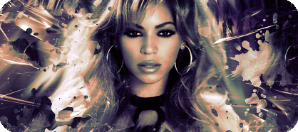
Anyhoo, I haven't updated this thread for awhile, so here's something I've been working on, trying to blend the stock with the background better.

beyonce.png


beyonce2.png
 
These are pretty good. There's just a little too much going on in the background, and your stock should be just near the center, not on the center. Also don't desaturate your stocks too much; you don't have to stick to only one or two pallets to make everything match. ;)
 
leela.png


Blah, I tried something different, like I used less gradient maps and only one photofilter.

I'm still loving that shape though :wacky:
 
I dunno what to think about that, to be honest. =/ It's a little too messy for me and the stock doesn't really suit the whole overall background. Perhaps try a different stock? Background looks pretty surreal...like I can't figure out if there's a mysterious shape trying to emerge or something...it's creative, I'll give you that.
 
leela.png


Blah, I tried something different, like I used less gradient maps and only one photofilter.

I'm still loving that shape though :wacky:
Definitely, not your best signature. The stock does not fits the background, and it just seems like random parts of it were erased and smudged...
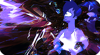
Then the background...the upper left corner looks messy....and it hurts my eyes...>_<
 
Blah, I shouldn't make signatures at 5am, they turn out shit xD

Anyway, this is what I'm working on for SOTW 41...

AngelinaSOTW.png


angelinasotw2.png


AngelinaSOTW3.png


angelinasotw4.png
 
Last edited:
I like the last two versions, so either one is fine. It's better that the sig is smaller anyway just so there isn't so much space and won't take the attention away from the render. The text still needs work though...or you can just leave without.
 
Blah, I shouldn't make signatures at 5am, they turn out shit xD
Well working late at night is fine for me. :neomon:
Anyway, this is what I'm working on for SOTW 41...
I love this theme :)
Looks fine, but the hair part is kinda edgy...
The best one :)
The stock fits, although you coud work some more on the text. I love the background.

In the third, the stock is too bright for such a dark background. The text is somehow....meh...in the fourth..
 
I'll keep the final version a surprise for SOTW :monster:

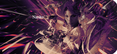
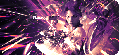
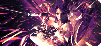
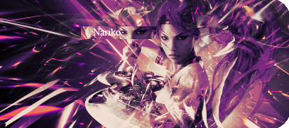
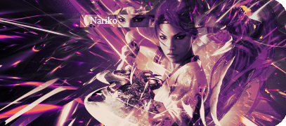
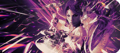
Now, I've been wanting to work with a render of Nariko for ages, so when I found one today, I had to make something!

Nariko.png


Too dark!

narikolightened.png


Too light!

nariko3.png


Just right? ;_;
 
Wow, that's probably like the best C4D usage you've ever done. I think the stock blends well with the background and the effects are quite pleasing to the eye. Text still needs some work though as it's a little blinding, although the text in the first sig seems fine as it isn't as light (albeit it still needs work as far as a few effects here and there).

Overall, great job!
 
Thanks for the compliments Mitsuki!

Anyhoo, I tried fixing it a bit more, and I even made an avatar to go with it ^_^

Edit - BAH. I'm trying to get it just right, which is why there's 3 different copies xD

nariko4.png


narikoavatar.png


nariko5.png


narikoavatar2.png


Nariko6.png


narikoavatar3.png
 
Last edited:
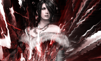
That Lulu one's pretty hot. She looks as if she's about to...explode or something. o.o Just the way you did the effects on her body...I think that kinda ruins it (like, it looks as if her outfit is being burned/torn in half), but it's a different concept, I suppose.

And finally...something not purple! =P Pretty nice!
 
Status
Not open for further replies.
Back
Top