Photoshop Meddlings

Status
Not open for further replies.
Wow, those are very colorful and grand! That Kirby one is made of win. Brilliant and neat-looking, it's seriously one of my favorites! :D Is this a Topaz filter you used? I really want to get it but stupid Windows won't let me grand permission! =[
 
Thank you very much for the compliments ^^

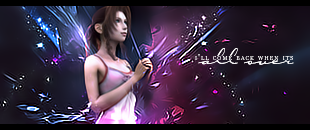
Anyhoo, this started off with me just tampering with the render - changing her dress from Pink to Blue, and I got carried away and made a whole signature xD

Crisiscoreaerith.png
 
wow! how do you do that??? I've tried tampering with the render before but it always ends up looking like shite
 
I duplicated the render, edited it, and erased what looked bad, so all that was left was the good parts, then merged them =]

And most recent stuff from me! I tried dabbling with making avatars >_>

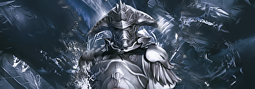
Ghissignature2.png


Aerithavatar2.png


AOTW6Entry.png


Meh, I made this one in a rush >_>

Black and white version

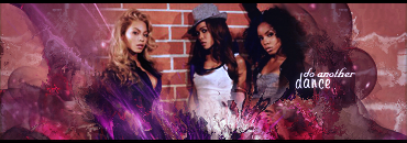
Destinyschildchallenge.png


Colored version

DC3.png
 
I like the Ghis one, but it feels a little bit empty to me. I also like the avvies a lot, but i think you need to add effects to them and use different text than just their names ^_^
 
Last edited:
Here's some more recent stuff. I've actually been trying to create avatars that go with the sig, but aren't 100% ripped from it =D

Bree Set

Breeavatar.png


Bree.png


ABBA/Agnetha Set =D

Agenthavatar.png


ABBAlove.png


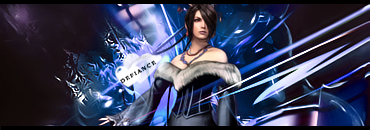
And, here's Lulu =D

Luludefiance.png


luludefianceblue.png


And here's the most recent sig I've made ;D

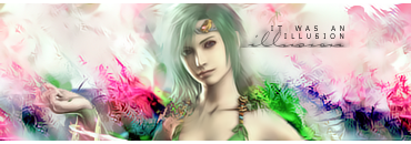
Rydiasotw.png
 
I love the Lulu one, it looks very well done and I'm just in love with the whole left side of Lulu, looks very good.

The Bree set is my next favorite, very nice job on the avi for that one
 
Thank you Bei Bei ^^

I liked my Rydia signature so much, that I made a whole set out of it =D

Rydiaavatar-1.png


Rydiasotw.png


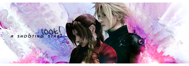
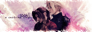
And here's two different versions of the same sig :3

CloudandAerith.png


CloudandAerith2.png


And an avatar to go with the sig =D

CloudAerithavatar.png


I was going to enter this for SOTW 61 but... I wasn't entirely happy with it, so I didn't, and I never got around to making it any better D=

SOTW61.png


And, this is a signature I made for the lovely Judge Rulia ^^

Lisawrestlesig.png
 
You're Rydia sig is damn fine Marky boy, as well as the last two I think. :3
 
I really like this one. Blending is very nice and the color in the BG is great. The subject looks a little colorless though, but I suppose it still works in the end. Text is a bit awkward...I think there's too many words. Perhaps lowering the font size would look better.

Overall though this is one of your greatest piece. I even like the graininess on the left and right side. Great job!
 
I don't know if the black text will go well with the avatar, but the sig itself is really nice and shiny. I really loves it :gasp:
 
Loving the new Yoda Set Artemis, the colours go well together and also the quote is in a really cool text
 
Thanks for the kind comments, they really mean a lot to me ^^

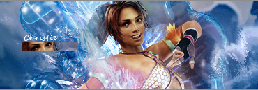
Anyhoo. Playing fighting games lately, I've remembered my first love. Tekken. So here's a Christie signature for you guys. Since I couldn't find a decent Nina Williams render D=

Christie.png
 
Christie? Never heard of her. I know Nina though. xD

Anyway, this is a great piece. The splashy effect matches her pose altogether and it shows that you've got control of how you do your effects instead of just slapping them everywhere. The color theme is also quite interesting. Bronze/Tan with blue. Very nice. My only suggestion is to change the text style. Somehow it doesn't really fit in. Other than that, it's great work and I really like the bubbly look to it. =]
 
Update ^^

This, I made for SOTW 63, I really like it -

SOTW63.png


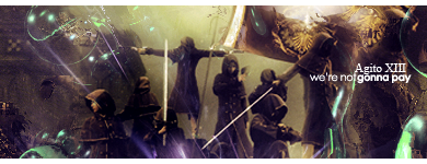
This was a request from Final Keyblade, and I think it's something I've made quite differently to all my other signatures -

agitorequestavatar.png


Agitorequest.png


And, this was a set request from my dear friend Lisa ^^ -

Lisaavatarrequest.png


Lisarequest.png


And, this is something I made tonight, while watching a movie. I really should do something more productive with my time like...do all the essays I have >___>

DC3D.png


I've been attempting to work more with stocks, as opposed to renders now...and I think I'm progressing with those quite well...

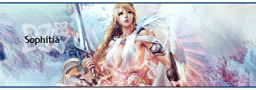
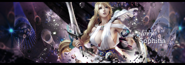
This is the most recent signature I've made...I know it's with the same render, but...it's the most "dynamic" image I have at the moment -

Sophitia.png


I really like this one. It's very different from your usual signatures, and just by looking at it, I wouldn't have been able to tell it was made from you. ^^ The C4D was used very subtly and for colorful lighting purposes, which I really like, so thumbs up for that.


Now this one...is just priceless. xD Definitely my most favorite one from you. There are a lot of effects going on, yet you managed to keep it clean and maintained. The purple is still there, but hey, it works. This is just a very fancy and beautiful signature. I keep looking at all the different effects, yet somehow the focus is still there on the subject. Great piece!
 
Status
Not open for further replies.
Back
Top