Navigation
Install the app
How to install the app on iOS
Follow along with the video below to see how to install our site as a web app on your home screen.
Note: This feature may not be available in some browsers.
More options
You are using an out of date browser. It may not display this or other websites correctly.
You should upgrade or use an alternative browser.
You should upgrade or use an alternative browser.
Photoshop Noobishness V.2
- Thread starter Dean Winchester
- Start date
- Tagged users None
^
The color dragons don't match the main image.
I say try to reduce dragons' saturation

^.
Its contrast is so low, add some more contrast to it.
If you want to make it dark, you can add some dark masks to it

^.
Needs to increase sontrast of the BG image also reduce the dragons' saturation same as what I mentioned above.

^
Nice mix of images.
just some tips...
- Add a little very dark red under the red border.
- Add some red invironment to Wesker and Zomies' hands

Just add some more designs ( with very low transparency ) to the white BG.
Its too much solid
Nice avi.
the foreground wesker needs some thing...
- Add another layer of it with blueish color and use layer mask to define it to match the blue BG. like he is really in that invironment and the blue space effects him.
I like RE ones
Thanks Shahab, I'll do it right away 

Yeah, I just must find a way to use the font better. Maybe if I experiment with other types of fonts and colors....
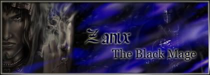
Did one for Zanix.
I used a simple font here.
Oh and here is an Aerith and Zack theme, sad though...

Yes, I tried to make her cry....was listening to My Immortal (evanescence) and felt a bit sad so here's the result...

Any comments?
I used a simple font here.

Oh and here is an Aerith and Zack theme, sad though...

Yes, I tried to make her cry....was listening to My Immortal (evanescence) and felt a bit sad so here's the result...

Any comments?
Last edited:
This is about the A/Z work:
You could have tried a better font for the name, and it's too big IMO, other then that fairly nice
The first two are just plain... not much to say.
Got to try harder. So it goes up like this:
-Reduce font size
-Dedicate it more time before finishing it.
Thanks

Did this one in about an hour...For Miss Valentine

Smaller Text like you recommended

And here's my new signature:

Last edited:
Julius. Try to add some foregrounds to your works, over the stocks.
Also, as for tears.
- Creat a layer with 0 as FILL opacity. Then go to blending options and add Bevel to it with 7 size and 70% Depth ( depends on your image size, its different )
Then use 30% hardness round brush.
Dupleciate your layer several times and then add each frame depends on what you want the motion to be.
Don't forget to use eraser tools too
Hope it works.
V .. Example... I did not put time for it. just made it to let you see an example.
you can put some times on it.
I used a thick brush, but you need to use smaller ones.

* Is late, runs to dojo *
EDIT:
I just noticed that you have used a layer of Aerith and add the cry to it and then dupliciated it and continued it.
No need to copy your stock, just add the cry layer over it as many times as its needed.
Also, as for tears.
- Creat a layer with 0 as FILL opacity. Then go to blending options and add Bevel to it with 7 size and 70% Depth ( depends on your image size, its different )
Then use 30% hardness round brush.
Dupleciate your layer several times and then add each frame depends on what you want the motion to be.
Don't forget to use eraser tools too

Hope it works.
V .. Example... I did not put time for it. just made it to let you see an example.
you can put some times on it.
I used a thick brush, but you need to use smaller ones.

* Is late, runs to dojo *
EDIT:
I just noticed that you have used a layer of Aerith and add the cry to it and then dupliciated it and continued it.
No need to copy your stock, just add the cry layer over it as many times as its needed.
Last edited:
Julius. Try to add some foregrounds to your works, over the stocks.
Also, as for tears.
- Creat a layer with 0 as FILL opacity. Then go to blending options and add Bevel to it with 7 size and 70% Depth ( depends on your image size, its different )
Then use 30% hardness round brush.
Dupleciate your layer several times and then add each frame depends on what you want the motion to be.
Don't forget to use eraser tools too
Hope it works.
V .. Example... I did not put time for it. just made it to let you see an example.
you can put some times on it.
I used a thick brush, but you need to use smaller ones.

* Is late, runs to dojo *
EDIT:
I just noticed that you have used a layer of Aerith and add the cry to it and then dupliciated it and continued it.
No need to copy your stock, just add the cry layer over it as many times as its needed.
That will save me a LOT of time XD, silly me. Ok, I'll try that next time. So how about the Dirge of Cerberus? I think is too "red"


Lol, yes, too much mono colorism.
Look at Vincent's face... You can add some Light orange there, also a purple layer at the other side ...

Or a BG light crossing over his face and come to the camera.

I did not have the PSD file, so I used FG to make it look like BG layer
But I like4 something in your DoC sig. The colors used there is matched with the characters.
Look at Vincent's face... You can add some Light orange there, also a purple layer at the other side ...

Or a BG light crossing over his face and come to the camera.

I did not have the PSD file, so I used FG to make it look like BG layer
But I like4 something in your DoC sig. The colors used there is matched with the characters.
I like the first one that u edited for him there Shahab. I definitly agree with his critism here because the one colour is kinda iffy. I like the ones that you make with the multi colours everywhere.
Thanks
I just wanted to show another effect for the brightness on his face to be match with invironment.
He can use it inteas of the light source at the first one in the left low corner.
He can use it or something like it and also add colors to it...
I just wanted to show another effect for the brightness on his face to be match with invironment.
He can use it inteas of the light source at the first one in the left low corner.
He can use it or something like it and also add colors to it...
Thanks
I just wanted to show another effect for the brightness on his face to be match with invironment.
He can use it inteas of the light source at the first one in the left low corner.
He can use it or something like it and also add colors to it...
Can you direct me to the Tutorial that explains how to do that ?

Can't find it

I don't have any tutorial for it...
Maybe I can explain it somehow for you
or send you a PSD file
then you can see layers and their placement
I will make an example for you, a simple one just to let you know how do I do it.
Give me your Email address please.
Maybe I can explain it somehow for you
or send you a PSD file
then you can see layers and their placement
I will make an example for you, a simple one just to let you know how do I do it.
Give me your Email address please.
And JA the sig that your are using atm... ITS AMAZING. I love the lightness and the darkness and where they are placed. It looks absoultly fantastic. Did you use BLUR around edges of the castlevania guys. Whatever you did keep it up.
I tried to do the same, here's the result 
I used different layers, added light and dark a bit here and there...still it needs more work. (and used a Resident Evil font for "Unleashed". Thought it might be cool )
)


I used different layers, added light and dark a bit here and there...still it needs more work. (and used a Resident Evil font for "Unleashed". Thought it might be cool
 )
)
I like it. It looks great. The multicolour with that sig is awesome. I dont see very many sigs as unique as yours.