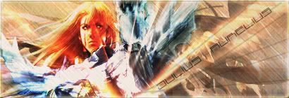
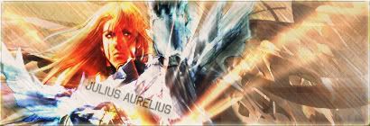
Photoshop Noobishness V.2

Well I decided to try out using C4Ds as advised, and here is my first signature with C4D. Now what I ask is simple, be honest and tell me what it's wrong and what is right about the following signature:
C4D-Sig-1-Raphael.jpg


Also these avatars:
C4d-Avatar-1.jpg


Sorel-SC4.jpg


Sorel-SC4-2.jpg


SOREL-SC-42.jpg


SOREL-SC-4.jpg
 
You see in the first avatar I can see an obvious layer in the left top corner:
c4davatar1hc3.jpg

otherwise I think they are really good especially the third one.
about the signature I think it's pretty good considering I am a beginner >_<
 
Overall, your avatars are good. Keep it up.

As for the sig...
C4D-Sig-1-Raphael.jpg

Your text is not good; it's tacky and too far away from the stock. There're too many abrupt effects. Like, you have sudden bursts of light everywhere.

Don't forget that you can manipulate the colors in a tag not only by brightness/contrast, saturation, and color balance, but also by selective coloring and floodfilling raster layers and setting them on various color blending methods. If you don't know what I'm talking about, then feel free to ask, and I'll provide screenshots n' shit.

I saw one of your posts in another thread, you say that you can't break your "newbie" stage. If it makes you more confident, do you wanna see my work from December? August? I was terrible, and I'm still not even that good. You've gotta start out somewhere, and if you practice hard you'll eventually get a lot better. One thing that I think helped me was hanging around ACF's GFX section (in which the members are very advanced) and observing their work. It helped me get a "feel" for what a a really good tag should look like. I'm a much better critique than a GFX artist. :P
 
Last edited:
For a first time user of C4Ds, you did pretty damn good. One thing I'll mention though...be sure to place your lighting outburst in the appropriate place. For instance, you've got some in the background, which is fine. But then you have one that touches the stock (left arm)...which then kinda ruins the general feel of the signature.

But overall, I like the signature a lot and definitely one of the best ones you've made so far.
 
L i g h t ♥;343883 said:
Overall, your avatars are good. Keep it up.

As for the sig...
C4D-Sig-1-Raphael.jpg

Your text is not good; it's tacky and too far away from the stock. There're too many abrupt effects. Like, you have sudden bursts of light everywhere.

Don't forget that you can manipulate the colors in a tag not only by brightness/contrast, saturation, and color balance, but also by selective coloring and floodfilling raster layers and setting them on various color blending methods. If you don't know what I'm talking about, then feel free to ask, and I'll provide screenshots n' shit.
Yes please, because I didn't get half of it.

I saw one of your posts in another thread, you say that you can't break your "newbie" stage. If it makes you more confident, do you wanna see my work from December? August? I was terrible, and I'm still not even that good. You've gotta start out somewhere, and if you practice hard you'll eventually get a lot better.
If you wish, it is the hard and straight to the point critique that somehow makes me want to try harder.

One thing that I think helped me was hanging around ACF's GFX section (in which the members are very advanced) and observing their work. It helped me get a "feel" for what a a really good tag should look like. I'm a much better critique than a GFX artist. :P
I was considering joining a GFX community, and get advise there as well. Thanks Light :wacky:


PS: I appreciate your comments Mitsuki, and I'll edit the lights on Raphael's arm as soon as possible. Thanks for your time :wacky:
 
Now I find that one a lot better than the last. It doesn't really look as if random effects were placed anywhere (like the last one) but it can still be improved. I'm not really digging the text too much, but I think it's due to the coloring, although the placement seems fine to me. Overall nice use of lighting effects in the background. You're getting better at this. =]
 
I can't take the screenshots now, but I tried to explain things clearly.

Okay, for floodfill rastering:

1. Select "layer," then "new," then select "layer...," and then a window will pop up. Click "OK."

2. Find the floodfill icon (the icon of a paint can spilling), and left click on it.

3. Select a color on the palette.

4. Fill the layer with this color using the floodfiller that you equipped.

6. On the layer table (the thing that shows your layers), find the drop-down menu that says "normal," and select various blending modes. Also mess around with opacities (opacity control is right next to the blending mode drop-down).

7. Try using various different colors and putting them under different blending modes. You can also set gradients on this (to do this, instead of left clicking on the floodfiller in step two, right click on it and select the gradient option that pops up, and on step three, select two colors.). Make sure the two gradient colors you choose match (like don't choose a combo like pink and green :confused:)

The Exclusion blending mode looks best under a very dark blue, and occasionally a very dark red. It should only really be used if your piece is really bright or has a lot of pink/red in it. Also, I'd advise you not to use the blending modes "Lumosity," "Color," Saturation," and "Hue."

One last thing; be careful not to wash out your piece with this (meaning to practically overtake it with a light color) or burn it too much (to overwhelm with dark color).

Selective Coloring:

1. Select "Layer," then "New Adjustment Layer," and then "Selective Color."

2. Now adjust the colors.

3. The concept behind this is to control the colors within a specific color. For example, if you adjust the "blue" in the "reds" by raising the blue to "100%," the red spots of your piece will look a lot more blue. Etc etc.

Is there anything else you don't understand?

Now for your current tag,
Signature-1-Sieg.jpg


This one's better than the last. The colors match pretty well, and the text is better. The only real complaint that I have is your usage of C4Ds. You look like you're using too many of them, and you're not using them properly.

I made a tutorial on C4Ds, here. It's my first real tut.
 
Last edited:
L i g h t ♥;348544 said:
I can't take the screenshots now, but I tried to explain things clearly.

Okay, for floodfill rastering:

1. Select "layer," then "new," then select "layer...," and then a window will pop up. Click "OK."

2. Find the floodfill icon (the icon of a paint can spilling), and left click on it.

3. Select a color on the palette.

4. Fill the layer with this color using the floodfiller that you equipped.

6. On the layer table (the thing that shows your layers), find the drop-down menu that says "normal," and select various blending modes. Also mess around with opacities (opacity control is right next to the blending mode drop-down).

7. Try using various different colors and putting them under different blending modes. You can also set gradients on this (to do this, instead of left clicking on the floodfiller in step two, right click on it and select the gradient option that pops up, and on step three, select two colors.). Make sure the two gradient colors you choose match (like don't choose a combo like pink and green :confused:)

The Exclusion blending mode looks best under a very dark blue, and occasionally a very dark red. It should only really be used if your piece is really bright or has a lot of pink/red in it. Also, I'd advise you not to use the blending modes "Lumosity," "Color," Saturation," and "Hue."

One last thing; be careful not to wash out your piece with this (meaning to practically overtake it with a light color) or burn it too much (to overwhelm with dark color).

Selective Coloring:

1. Select "Layer," then "New Adjustment Layer," and then "Selective Color."

2. Now adjust the colors.

3. The concept behind this is to control the colors within a specific color. For example, if you adjust the "blue" in the "reds" by raising the blue to "100%," the red spots of your piece will look a lot more blue. Etc etc.

Is there anything else you don't understand?

I'll save a copy of this as a Word Doc :monster:, then I'll have to read it more than once to get it all :confused:

Now for your current tag,
Signature-1-Sieg.jpg


This one's better than the last. The colors match pretty well, and the text is better. The only real complaint that I have is your usage of C4Ds. You look like you're using too many of them, and you're not using them properly.

I made a tutorial on C4Ds, here. It's my first real tut.
I'll keep trying, thanks for the Tutorial :neomon:

-Update-

Check these ones:
C4D-Avatar.jpg


Avatar-1-Sieg.jpg


And the same sig with two different text positioning:
C4D-Signature-2.jpg


C4D-Signature-1.jpg
 
Last edited:
I like your last signature but the problem is the text, however I can't advice you about anything considering I'm not better in the texts.
 
This one's pretty good. But you honestly don't need the filtering.
Also, I think your text is getting a little better. It looks better on the 1st version imho. Capitalized Myriad Pro font is what I've been using in my latest tags/icons, you should try using that font maybe. Sometimes it may not be the sig maker's fault that text is turning out bad. Sometimes sigs just look fine without text. When text should be placed into a signature, it looks good when placed horizontally (9 out of 10 times). Also, are you cutting the C4Ds out or setting them on screen/lighten/dodge?
 
L i g h t ♥;348893 said:
This one's pretty good. But you honestly don't need the filtering.
Also, I think your text is getting a little better. It looks better on the 1st version imho. Capitalized Myriad Pro font is what I've been using in my latest tags/icons, you should try using that font maybe.
Downloading Font right now :neomon:

Sometimes it may not be the sig maker's fault that text is turning out bad. Sometimes sigs just look fine without text. When text should be placed into a signature, it looks good when placed horizontally (9 out of 10 times). Also, are you cutting the C4Ds out or setting them on screen/lighten/dodge?
I am just cutting them, reducing visibility, and erasing a bit of the areas here and there.:confused:

EDIT: Can't find the font :shame:
 
I am just cutting them, reducing visibility, and erasing a bit of the areas here and there.

Ah, I see. With C4Ds, you're supposed to set them on the screen, lighten, or color dodge blending mode. You're not supposed to cut them out. The option to change the blending mode is the drop-down thingy to the left of the opacity meter.


Make sure to keep them on top of your stock and erase parts that look bad on it.

EDIT: Can't find the font

Did you check both on the internet and on your computer?
 
L i g h t ♥;348921 said:
Ah, I see. With C4Ds, you're supposed to set them on the screen, lighten, or color dodge blending mode. You're not supposed to cut them out. The option to change the blending mode is the drop-down thingy to the left of the opacity meter.


Make sure to keep them on top of your stock and erase parts that look bad on it.

Ok, I'll be looking at this while making my next sig.....now what I need is a theme :wink:

Let me check next week's SOTW:wink:
Did you check both on the internet and on your computer?

Not on the computer, still looking in the Internet at the moment:wink:
 
Holy shit, that tag is great. The background and stock match, the lighting is good, the text is good, the size and stock placement are good, and the composition is good. Great job.

I don't like the avatar, though, because the text clashes with it like crazy. Other than that, it's okay imo.

Also, in regard to the font, I'll try to upload it off my computer tomorrow.
 
L i g h t ♥;349404 said:
Holy shit, that tag is great. The background and stock match, the lighting is good, the text is good, the size and stock placement are good, and the composition is good. Great job.

I finally did it! I actually took my time with this one and made it....like 10 minutes ago...:neomon:

It seems that all of the advise did work :)
I don't like the avatar, though, because the text clashes with it like crazy. Other than that, it's okay imo.

Also, in regard to the font, I'll try to upload it off my computer tomorrow.
I'll just remove the text :wacky:
 
Wow! Agreed with Light here. By far the best sig you've ever made, Julius! Wonderful job!

And avatar looks fine to me.
 
ٍI like your Edward Elric signature it's great the colors blends well, I have to install CS2 >_<
 
Back
Top