- Joined
- Feb 25, 2010
- Messages
- 3,732
- Age
- 31
- Location
- Southend, UK
- Gil
- 0
- FFXIV
- Yuno Mizuno
- FFXIV Server
- Lich
- Free Company
- Silver Lining
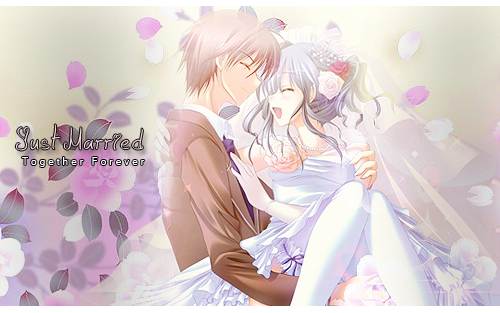
Something I made while I was in survivor 


Follow along with the video below to see how to install our site as a web app on your home screen.
Note: This feature may not be available in some browsers.


 The only real issue I had with it was how my attention was immediately towards the lighting near the top. It's fairly strong, but not too bad if you don't completely focus on that. Overall, it's very cute.

I will say, you are improving quite a bit.The only real issue I had with it was how my attention was immediately towards the lighting near the top. It's fairly strong, but not too bad if you don't completely focus on that. Overall, it's very cute.
... Are you married?

 but I wanna get married, the signature was inspired my my and me girlfriend's relationship

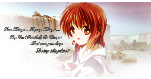

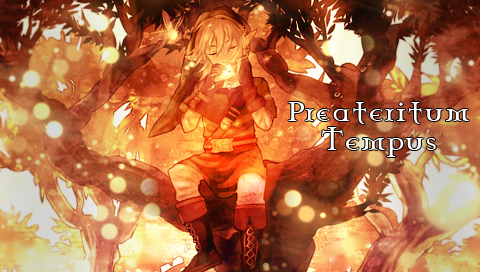

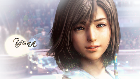


 tried some stuff with C4D's for effects
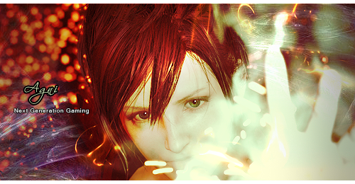

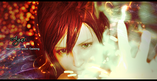
somebody commented on my thread 'faints'
Aset I made for myself last nighttried some stuff with C4D's for effects


made a black border version for another forum i'm on as they use a white background

 i'm in a sonic mood atm, and amy starting to warm to me as a character.... soo a sonic and amy signature was in order
  , discovered a epic lighting method as well, kinda looks like the lighting cali or raul uses xD


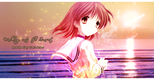

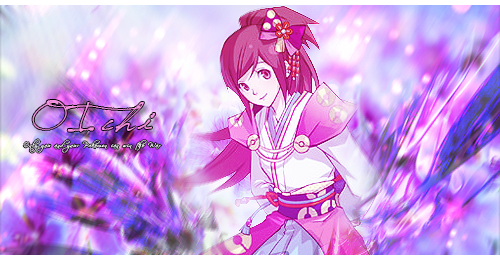

 :
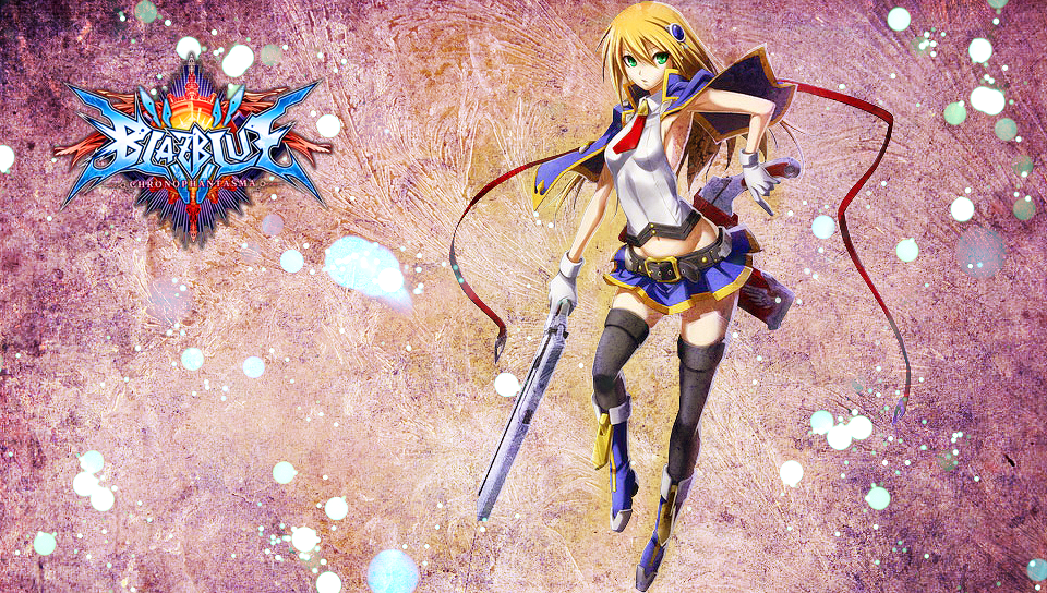
:




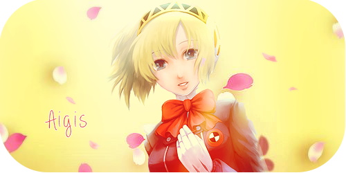
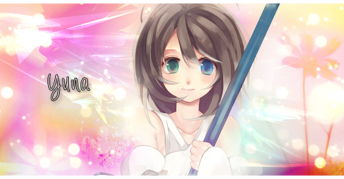
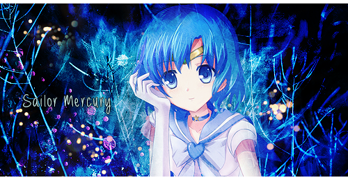
So far these seem to be my favorite from you so far. The images in them both are blended well into the signature and the effects are really eyecatching! The white borders are a nice touch too. Another signature I like is your current set but I was too lazy to find it's image link xD. - I will say though to watch the oval signature thing as sometimes making it that shape looks wonky and weird depending on the method you use.

 like adjustment layers, a new text method (thanks raul) and just spending more time adjusting my work til it right
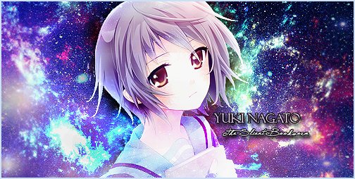

 The effects are so good. The background colors really compliment her gray hair, and it has depth. Some might say the girl's head might need to be more blended in, but I really like how her body is blended but her head sort of pops out. It makes a really nice focal. And the new text style is really nice too! It also adds depth. Great job Stevie!
