Stevie's Graphics

Status
Not open for further replies.
another new signature, got the text method down this time, and I somehow managed to save the background, I managed to make it all blue and ew like :O
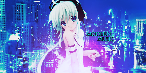
AnimeMusic.png

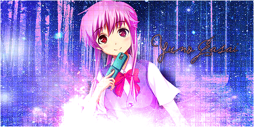
Not bad. I like the purple/pink effect lighting. And the background is nice! You just need to work on blending the full body a little more, because her head seems to pop out more from the rest of her body. Also, nice work on the text (y).
 
yet another sig, not soo proud of this one

YunoSig.png
 
was in a random dam mood, so here a animated signature

33eir6f.jpg


I'm soo glad that I can remember how to do them :yay:

EDIT: yeah photobucket fails at uploading gifs, so I had to reupload it on tinypic
 
Nice quality.

There's no border on the bottom though, and the text moves, as does the right side border. :wacky:

Nice job though. It's clean and simple.

that was photobucket falut :O I just reuploaded it in tinypic

33eir6f.jpg


that should be better
 
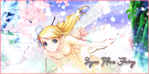
New set for my name lew ended up giving me :wacky:

SugarPlumFairyAvatar.png


SugarPlumFairy.png


not a fan of the text
 
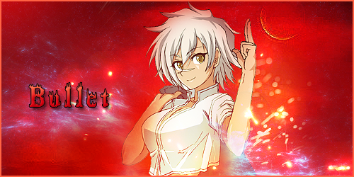
update, a set i made earier today

BulletRequest_zpsc8da04a1.png
 
I didn't get a chance to look through all of your work, but I like what I see so far. O: There are a few things I would point out, though, just for reference.

yet another sig, not soo proud of this one


YunoSig.png

This set has a lot of misc. "noise". It's not really noise, but the cluttered star stocks you used make it seem so. You could try erasing from the background a bit to remedy this problem.

New set for my name lew ended up giving me :wacky:

SugarPlumFairyAvatar.png


SugarPlumFairy.png


not a fan of the text

This tag is so bright! You should pick one source of light and stick to it. Generally, a good way to determine where to put the lighting in your tag is to see how the shadows fall in your stock image. This adds depth and personality to your image, making it much more appealing to the eye. I'm not a fan of the text, either. :/

update, a set i made earier today

BulletRequest_zpsc8da04a1.png


I like this one O: You did the blending and lighting really well in this tag. I'm not a fan of the text, though. And I think you might be oversharpening! Try using a new layer-> apply image -> sharpen and then lower opacity to ~60%. This is a failsafe way to sharpen images.

You're getting better O: Good luck with your endeavours!
 
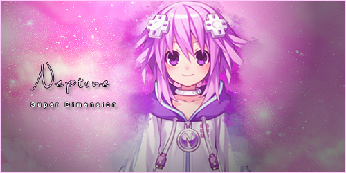
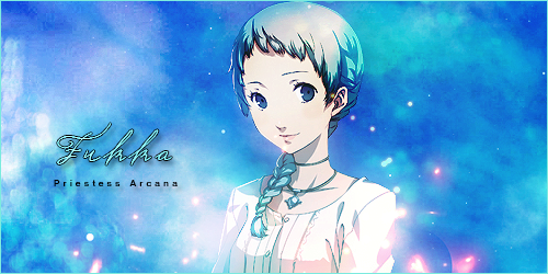
good day all, been a while since updating :eek: here are a few new signatures to enjoy :)

Neptune2_zps478fabe1.png


FukkaAaron2_zps0d3f66c7.png
 
sooo, after 3 hours of playing around with vectors, 3 thrown away signatures, following about 15 different tutorials later, here is my results of trying out vectors

MikuVector_zps260d1723.png


I even tried a new text technique :P
 
I see you like animu. I don't especially but the renders are great for working with on sigs. N'est-ce pas?
I like your work, and having not done any sigs for about three years seeing stuff like this again inspires me to maybe try and do some again mself in the near future and totally embarrass myself. So thanks for that, I suppose.
As I said, I like your work but I do believe C&C is better than just bum kissing. I reckon some of the images look a little flat, personally I'd use a bit more lighting effects to help the stock stand out a little from the background but there you go. I also think the size of them is way too big but that's personal preference. I think your current signature that you're using on the forums looks much better as I tend to find stuff with huge dimensions ends up with a lot of wasted space.
How long have you been using whatever it is you use to make the sigs? I'll assume Photoshop for now. Forgive me for not flicking through every page of the thread but I would say the weakest point of your sigs is the text, something which I know all about, believe me. I really suck at text and was wondering what sort of techniques you've used in the past to try and better yourself?
I hope I don't come off as too critical, nor do I hope I come across as a complete pansy.

tl;dr: i lik da colurz. Or something like that.

errrr, thanks i guess :), I always love C&C

as for your questions, 1. I hate text with a passion xP. 2: I been using Photoshop for 2 years almost now and 3: I use a mixture of techniques :), I love experimenting with new things, for example, my newest work was made because I wanted to try out vectors :)
 
You're welcome, I suppose.
I'd give some advice on text but I don't have any. :monster:
Vector closest to the stock is a little hard to see on your latest work is all I'd say. I would say? I mean "I will say".
Anyway, I like the colours.

-fin-
 
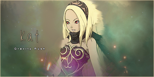
Few new Siggies

Callout with Toni, lost 6 - 2 :wacky:

ToniFemaleCharacter_zps17cbb426.png


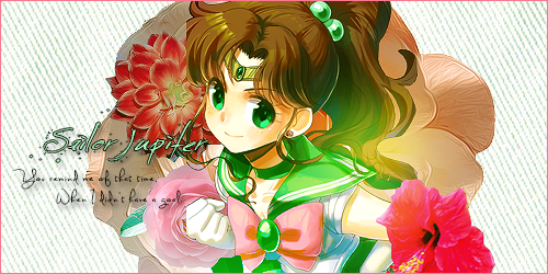
A SOTW entry I did a little while ago

FemaleGameCharacter_zps053a9868.png
 
aww i loved your callout entry against me, I loved that you gave the flower thing a go! If you keep working on it I think you'll manage to perfect it!, the text was really nice too but maybe the smaller writing was a bit spaced out from eachother. The pink flower on the left looks a tiny bit out of place too but otherwise I think you did awesome!
 
thanks for the comments guys

here a siggie I made for another forum

KairiSignature_zps8f7d8c92.png
 
Wow, Stevie, your work has really come a long way since I last posted in this thread! :yay:

This piece is absolutely gorgeous and I would love to see how you made it. :) I really like the colours used, the use of light and the simplicity to this piece. The green flare works very well, I think, and adds some balance and depth to the piece. :hmmm: The text is excellent! :) I think this is the best example of text I have seen in your work! :) Bear in mind, I haven't been around a lot recently, so there could be even better examples I haven't seen. :lew: Either way, fantastic work! :)


I really like the colours and simplicity in this piece too! :) The use of what appears to be C4Ds and/or lens flares is also great as it adds depth and makes the piece more dynamic. ^_^ The contrast between the purple on the render and the dull background also works really well. :)

 
new siggie, mostly to test something out

 
Status
Not open for further replies.
Back
Top