Kandy-Sugar's Photoshop 7.0 Attempts

CT4copy.png

I kind of agree with what Lew said above. I see this tag as two elements: the render/stock and the background. Both of these elements are quite nice when considered separately. The stock has some interesting effects done to it, and personally, I like the feel of it. The background is simple and effective, and the little dots are a nice touch.

I think a little bit of color correction and/or blending would help these two elements come together. :awesome:
 
Thanks heaps for all the comments and helpfulness guys. =D

I think that I wanted to make the last tag I did, look more open and warm on Tifa's side and more reserved and cold on Cloud's side to match their personalities a bit.

Obviously it didn't work so I shall work on bettering myself. XD

Haven't been able to touch photoshop this past couple of weeks really, due to being sick so no updates at the moment. >_<
 
Oh that avatar is ace. I voted for it.
I usually hate 150 square avatars but that one is awesome. I love the was of colours and the subtle lighting. There really isnt anything i dislike about it at all tbh, and it fits the life and death theme perfectly.
 
Here's my AOTW 42 entry:

8copy.png


C+C please. =)
I'm with Lew, I'm not normally keen on 150x150 avatars but that one's truly sensational! I love the cleaness of the stock and the soft colours go amazingly well together! And the border really rounds off a top quality avatar. Keep it up :awesome:
 
Thanks heaps guys! =D

I usually despise 150x150 avatars, but this image was too nice to shrink to a 100x100 avatar. >_<

It would have lost most of the detail if I went and did that! XD

I discovered the beauty of smudgy brushing in this one. XD I think it's one of my favourite to date. =)
 
I just did a request for someone on the forums and thought I'd get some C+C on it.

I made two versions of the avy and sig, though there isn't that much difference between them. Just the borders and the little lines underneath the text in the signature.

Avatar:

3copy.png


4copy.png


Signature:

5copy.png


6copy.png


Let me know what you think please! Any advice is appreciated. >_<

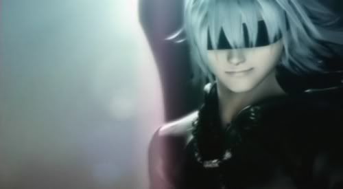
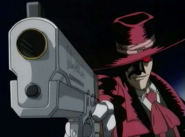
Stock used:

kh27.jpg


Alucard_02.jpg
 
Last edited:
Avatar:

4copy.png


Signature:

6copy.png

These two are the ones I most like out of the choices, I like the soft sparkle effect on the Alucard sig, and the recolouring of the gun, the text is well done and I like the line from the outside coming to meet the text, although I do seem to feel a stronger use on lighting could make this piece more striking, but thats just me...

for the Avatar, the text and background are excellent, and you have done a good job doing what you can with the stock render, but the general blurriness of it does let it down, but the stock was blurry in the face place, and you have done a great job making it workable, I do like the text and feel it does compliment the image however, and does take a great deal of focus away from the blurry stock, so good job all in all and keep it up ^^
 
I'm not 100% sure about teh font on the Riku sig. It might just be that there is a fair bit of it. Other than that, I love the lighting. It's simple, but very effective.

As for the signature. I prefer the bottom of the two. The lines for the next are neater. The gun is pink :wacky: but its nice. You brightened the original image up which looks great and though it's a pretty simple piece, it looks nice.
You're definately making vast improvements. Keep up the good work hun!!
 
Thanks guys. =) And the text in the avy was what they guy wanted. XD
So I did it. XD

AOTW 43:


13.png


I really wasn't happy with this one.

I was rushed for time and the softness of it shit me off, but I couldn't be bothered to try fixing it once again. XD

By the way the image is of David Beckhams hand riding up Victoria's dress. XD
 
Last edited:
It's really bright tbh. =\ The text placement can be better. <_<

6copy.png


This one is good but you need to place a few brushes somewhere, that's all I have to say about it.
 
13.png


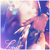
I like that one, it has a really nice soft look about it, and suits the lust theme perfectly. The effects are amazing and the font is nice. I don't really know what to say on avatars :ness: You've probably seen my comments on your sig in the LP section :)
Keep up the great work girl! :awesome:
 
Signature:

5copy.png


6copy.png


Stock used:


Alucard_02.jpg


Judging from the original stock and the finished tag, I'd say you did a pretty awesome job. :gasp: The colors are stronger and it draws more attention to the stock. I especially commend your use of the glowing orbs (brushed?) because it fills up the piece nicely. I like the bottom tag's text style better, out of the two.

Make more, k? :gasp: I'd love to see.
 
Ahhhh i would never have guessed either of them were yours.
I like the avvy, hence why i voted for it, its clean and professional just the way i like my avatars to look. Awesome work on them as usual.
Your sigs are gettin a lot better aswell, i like the white glow lines beside cloud and the starry background ur tag has, the text looks really good which surprised me as i wouldnt have thought having lines around the text would be a good effect but i really like it.
I would say try to using some lighting to make clouds face the focal point, try some black and white gradients on a soft light blending mode or apply the image then use the render light effects filter, i think ul see huge improvements if you do.
Good to see your still improving, well done ^^
 
Thanks for the comments everyone. =)

Much appreciated!

Here's my latest AOTW and SOTW entries:

AOTW 44 - Preset Renders:


6.png


SOTW 94 - Preset Renders:


14.png

I knew they were yours because I could tell by the lines on the text :awesome:
Anyways, they're fantastic, the render placement is really well done and looks really clean, the lighting looks professional and the text placement and font and done really well. Great job. :)
 

The more I look at this one, the more I think it's pretty good. :wacky:

Text is particular is quite nice, "the lines" add a lot to it, and I like the Final Fantasy font you used. I wish I could find that "balance" of coloring in two different pieces of text that make it fit like that. :gasp:

Nifty brushwork and blending as well. I like the "faded" quality of the tag as well.

Good job. :monster:
 
That Cloud SOTW looks neat,the colors match perfectly and the text looks great too.

The Zack Fair ava looks nice,it's simple and eye catching.
 
Back
Top