Kandy-Sugar's Photoshop 7.0 Attempts

FFVIII3.png


Lovely Icon, the text is placed nicely, and kept simple, the purple/pink colours on the bottom right corner are nice, I especially like the shade of lighter purple towards the left, out of the text. x] Omnom. The watermark effect (if that's how you call that one) looks really nice, and faded. Nothing I can say that would make this avvy better in my opinion. :)


11.png


AHA! So it was you!

:wacky: You have no idea how Lew and I were puzzled about who made this. I thought it was Lew's siggy, :wacky: It's an amazing signature, unusual dark colours from you, but you worked with them really nicely. Text is placed well, and the bright colours on Vivi seen to have been nicely thought out.

Keep it up babes!
 
11.png


Hahahaha what Kira said. WE were trying to work out whos this was. Youve improved a great deal recently. Loo at your work in the last couple of pages compared with 3-5 pages back. Massive improvement.
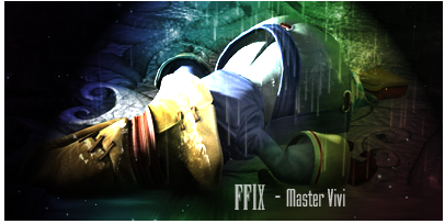
AS i said i like the clean look to this signature, its very easy to make out and very pleasing on the eye. My only neg would be the lighting THe spotlight is coming from the wrong direction, its also a little too dark at the sides it it was that bright thered be more light hitting the render and no shadow.
Aside from that wee neg its a great tag and ur improving alot, well done and keep entering sotw and practising. :)
 
Thanks for the lovely comments!

Here's my latest entries from last week.

AOTW 55:


FFVIII3.png


SOTW 105:

11.png

I voted both the avis for the AOTW. They were excellent.

The LP was imo too smudged, but the whiteness of it filled that up. The text was also wonderful, as with the border.

This sig was imo too dark on the outside but grat drop on the raindrops and the colour. <3

Keep it up Kandy! :monster:
 
FFVIII3.png


This is easily one of the nicest avatars of Rinoa I've seen. It's clean, it's simply and it's lit up beautifully.

I love the purple, blue, pink sort of scheme. It's very easy on the eye.

And the text placement is spot on. I definate fave of all time for me from you, my dear.


11.png

This actually reminds me more of a Mitsuki piece. She won a sotw with this vivi image and the colouring is similiar. It's beautifully done.

The only thing I can say is the darkness on either side is a little too much. It's a lovely piece though and I simply adore the colours.

The border looks fantastic and the text is brilliant.

Keep improving Kandy, you're doing amazing <3


SOTW 105:

11.png


It was you...you were the one who did vivi....
Very nice siggy may i add. Love the colours and the text. The only thing that bugs me i that theres too much darkness, maybe brighten it up a little???

Awesome work kandy!
 
AOTW56.png


I like the light you have coming from his foot, it gives the tag energy and makes it appear as if hes away to shoot. I think if youd used some red in the BG it would make the colours scheme of the tag more appealing overall but on the whole its a nice icon. =)

SOTW 106:

SOTW106.png


I realised after I submitted my entry, that the 'S' on his chest was back to front. <_<
Hahah i never noticed that actually, its not something that ruins the sig in anyway though. I like the 3 colours you have here. they all syncronise really nicely and look very soft and appealing. The light on the bottom left is nice but it looks out of place on the top right as his leg is in shadow and if there was a light source there his leg would be bright.
I think the text is fine as it is, im not too keen on the font but i think uv positioned it pretty well and the variation of colours in it is an add i like alot.
Nice job;))
 
AOTW56.png


I thought this was very well done. The lighting, BG and render was perfect. The only thing that bugs me is no text.

SOTW106.png


I didn't think the S mattered much. The text and BG were stunning. Well done! :monster:
 
You still got a vote for each >_>

Anyways, i like the avvy, the colouring was really well done and I love that little line you got there. Text is good too.

The siggy is ok, though its hard to focus on one thing when you have 2 pics...maybe its the text i need to focus on? I dunno. The border is always a good addition to a siggy or avvy, so naturally the border looks good. the text is nice too. What font did you use?
 
  • Like
Reactions: Six
I think the only thing main thing letting down that signature is the text. I love everything else in it, the bubbly water effect and the mesh of blue and red.
I think the fonts are too plain, something a bit more ''exotic'' would look better. Have a browse through dafont, its an awesome site. I think it would be better placed to her right aswell just below the centre line of the sig.
Great job though, your progressing rapidly so keep sticking in ;))
 
I thought it was a really pleasant sig also.
You've complemented the red and blue together really well, especially since with those two colours it would be extremely difficult to do so. The bubbles are also a fantastic element to the sig, it really brings attention to Reimi, and at the same time, adds more depth to the sig.
I have to agree with Lew about the font though, it's probably the single thing that's letting it down. I think the idea of a simple font is a fantastic idea mind you, you should try Augustus which can be found at Dafont, and also move the circles to the right of Reimi's name and see what that looks like.

Don't get to hooked on the font though, it's the one thing that no matter the level of GFX someone is they nearly always find the font difficult at some point or other. Anyways, you're rising amazingly fast, keep it up! ^^
 
5.png


I was wondering who that was...^_^

Really love the light effect, and the bar that the text was on, but the text itself can be improved :) Mebbe a different colour?

Well done so far and keep it up! :monster:
 
No CnC here, just C... :wacky:
I think your avatars are fantastic. I find it really difficult to work with small canvases but you seem to have a real knack for working with them. The colours are all vibrant and the cloudy feel that they have really adds to the appeal, he Tifa-Cloud and Yuna-Tidus avatars convey a lot of emotion in particular.

As for the signatures... they're providing stiff competition in the SOTW -__-... which is good :awesome:
 
Aww! It's so cute! The idea of it is what I love the most. ^_^ It has nice color as well as nice blending giving it this soft effect. I love the 2 x's as the text, it's cute and goes nicely with the lion and the lamb. I'm not sure if I like the little color swish above the text or not, it most definitely adds more color to the avatar.... I think it's growing on me the more I look at it! lol

I like your style! Keep it up! ^_^
 
Back
Top